Apply 5 Secret Techniques to Improve Redesigning an Entire Icon System
Outsystems is a low-code platform for the development of mobile and web applications. Outsystems has helped developers to build applications quickly and efficiently.
A low-code platform is used to development of applications faster and with minimal hand-coding of software development.
Outsystems is a powerful, low-code development platform for developers looking to publish their applications.
Benefits of Low-Code platform
- Speed – This is all benefits of low-code development. So just drag and drop this functionality, pre-built user interfaces, and models for business processes, logic and data models.
- Agility – Adopt quickly to market changes- internally and externally. Responded rapidly and flexibly to customer demands.
- Multi – experience made easy – Its development offers pre-built templates, automated refactoring, and also easy chatbots.
Outsystems has different components and tools available i.e.
- Platform Server –
This server compiles, deploys, manages, runs, and monitors the applications inside your infrastructure.
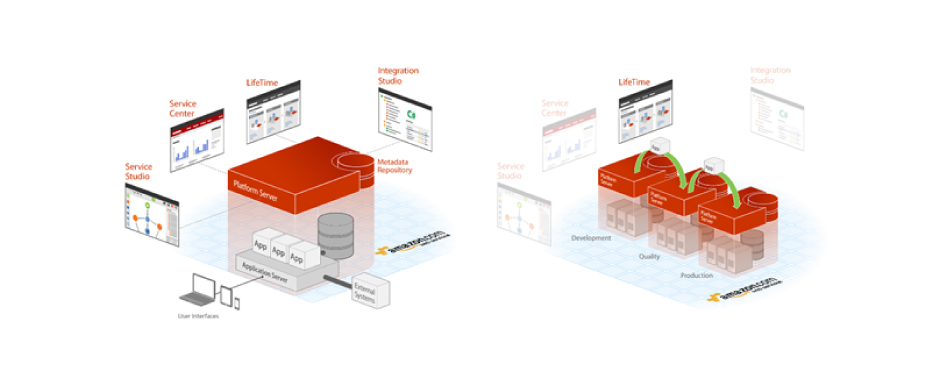
- Integration studio –
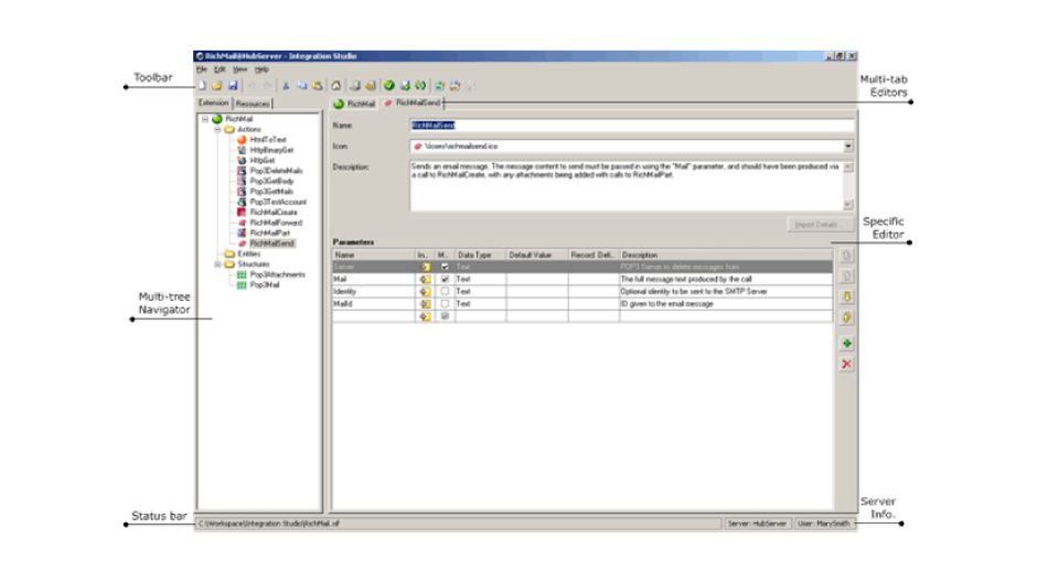
Integration Studio is a desktop tool and that allows you to create and manage your extensions.
The workspace is divided into different areas like Toolbar, Status Bar, Server Info, Multi-Tree navigator, etc.
- Lifetime –
It manages the life cycle between the environment and the server.
It is also a web application that extends the service center capabilities.
Lifetime is a centralized console for managing your Outsystems environments, applications, IT users, and security, covering the full application life cycle from development to deployments.
You can access it at https:///Lifetime.
You can use easily navigate from here to the management console of each environment.

- Service studio –
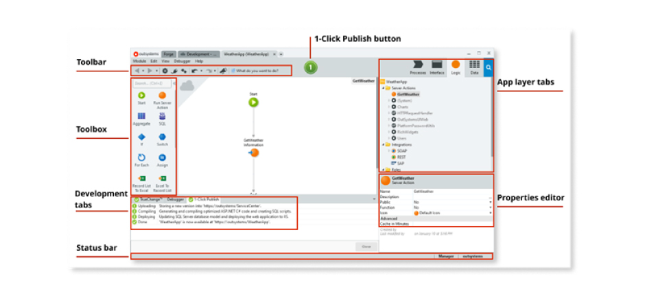
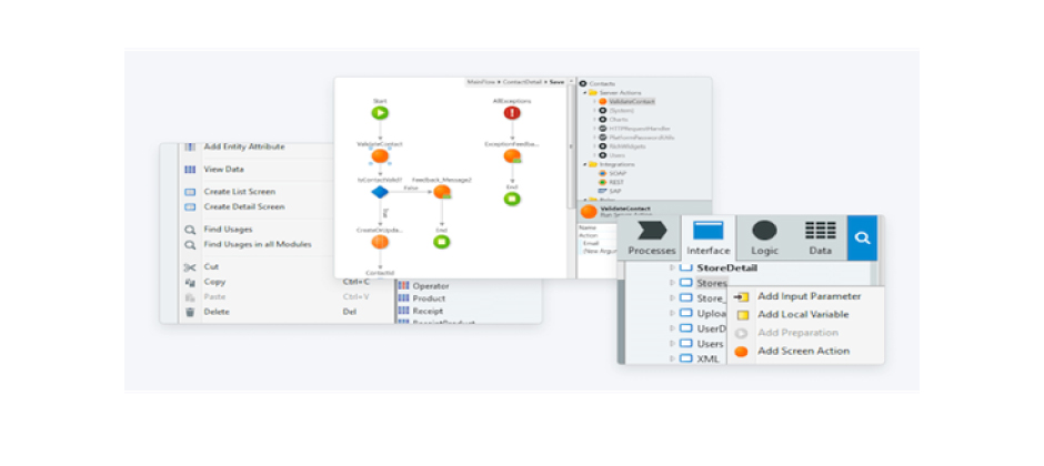
Service studio is an Outsystems low-code and visual development environment. That allows you to create the applications and modules on the server.
Create the user interfaces for Traditional web applications, Reactive web applications, and mobile applications.
We can debug your applications.
There are 4 layers in the service studio:
- Process Layer: It contains decisions, events, waits, Business processes, Human Tasks, Automated Tasks.
- User Interface: It contains UI flows, Themes, Images, Scripts.
- Logic Layer: It contains client actions, server actions, Roles, Integrations, Exceptions.
- Data Layer: It contains entity diagrams, entities, Structures, Client variables, and site properties.
- Click Publish.
Redesigning an Entire Icon System
What Is an Icon?
Icons are truly a universal language so We’ve been using symbols to communicate ideas since antiquity.
When it comes to user experience, icons have the way for a smooth and delightful interaction with a product. An icon will communicate concepts at a glance. They lower the cognitive load and make better use of space in interfaces.

OutSystems is an icon and visual programming languages are a key ingredient. The visual representation of the OutSystems language concepts. After that, we upgraded our product, and we have the opportunity to completely redesign our icons from the ground up, reinforcing our commitment to the modernization of the platform.
Our basic guidelines
-
Size Matters
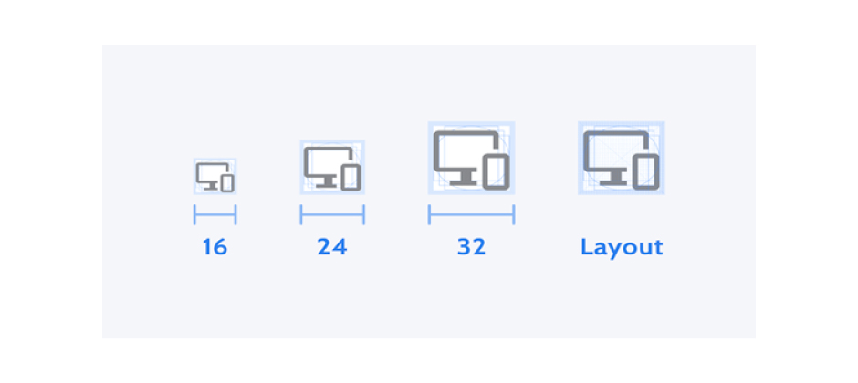
Our icons are designed on a base layout grid of 16×16 pixels and scaled up to provide additional sizes: Small (16px), Medium (24px), Large (32px).When designing a new icon we set out with the 16×16 layout to ensure readability at smaller sizes.
-
Consistent Icon Grid
With the icon grid and clear guidelines, we can achieve efficiency and consistency in the icon system. In a product with such a large number of icons i.e. 2,000 and counting and designers spread across different teams.
-
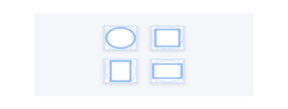
Use Keyline Shapes
Keyline shapes set the foundations for the icon grid. Using these shapes as guidelines strips out the guesswork from the designers’ work, and using them to keep proportions and placement consistent throughout the icon system.
-
Live Area and Padding
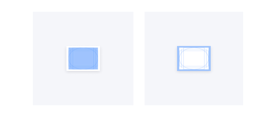
In the Live Area and Padding of the 16×16 base, icons have a 14px live area and 1px reserved for padding and additional optical adjustments if needed.
-
Style and Forms
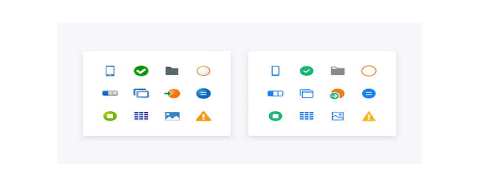
After deciding the icon’s goals and principles, we redesigned its shapes to be consistent with the Product Design System styles. We can change gradients and the 3D-looking icons into flat colors and straight lines for better, and less visual clutter.
Modify the App Icon
When you create a mobile application then the icon for the app is generated automatically in the app creation wizard.
Define Custom Icons for Your App
If you want to change the default icon and you can use your icon image, providing multiple versions regarding the icon’s context, device screen size, or density:
- First Create (if not yet created) a ZIP file then add all the Android/iOS icons (.png image format).
- Then Open the main application module after that import the new or the updated ZIP file to the resources folder.
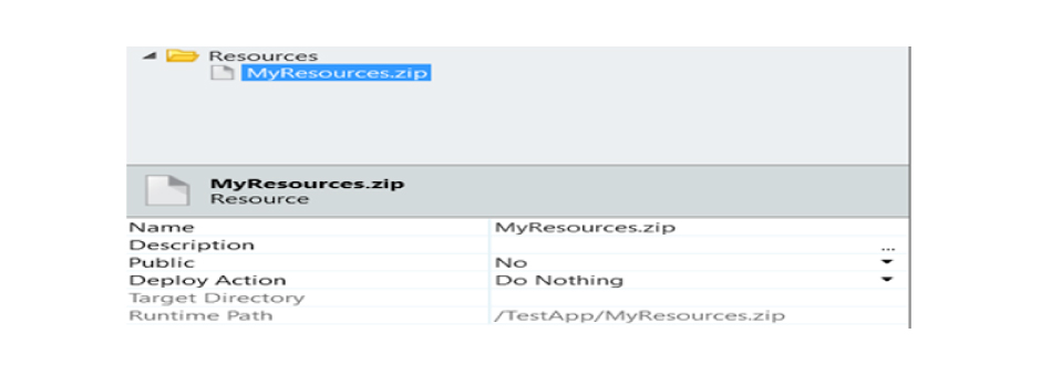
- First you can select the application module and go to its properties and open the Extensibility Configurations property.

- You must create a JSON object in the Extensibility Configurations value window, where you can specify all the information about the icons to use. If it is not specified, then start by indicating the resource file that contains the icons.
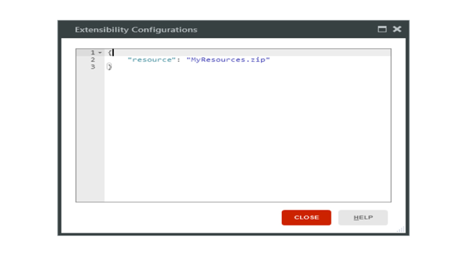
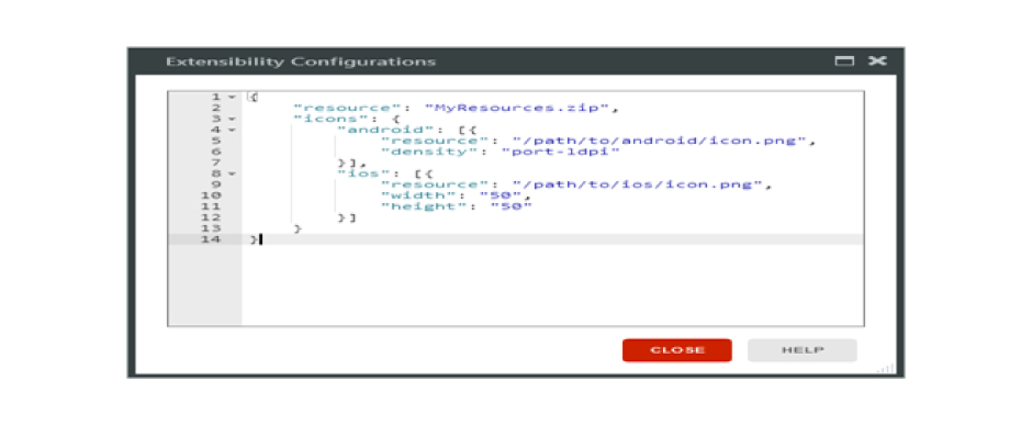
- In JSON to Add the “icons” tag it has indicated that you want to use your icons for your application. Each mobile platform has specified the size of iOS and density of Android and icon location in the ZIP folders. Please make sure that you define icons for all sizes and densities available, otherwise, you’ll get an error. You need to check the JSON template for the icons to avoid mistakes.
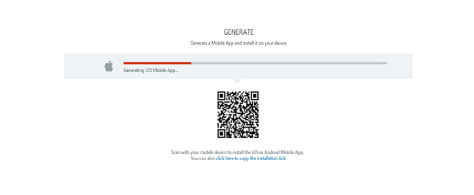
- To make this change available for the users, publish and generate a new mobile application and distribute it.
RECENT POSTS
CATEGORIES
